DISCOVERING MENORCA
Microlearning
I’m always curious as to how we can use eLearning as a tool for marketing. I believe eLearning can be a fantastic tool for providing information and an alternative to traditional ‘brochures’ (both physical and digital).
One of the industries I think could benefit from using eLearning as a marketing tool is travel and tourism. I therefore set myself the brief to create a short microlearning that would act as an informative ‘brochure’ for a faux travel company, or alternatively for a country / council website. (For example, ‘visit Spain’)
As it is a country I am familiar with, I chose Menorca as the subject for this eLearning. At first, I needed to do some research and scope out what information would be valuable to know, for someone booking a potential holiday. This didn’t include specifics such as prices, more so information about the area, what there is to do and any cultural nuances. I didn’t feel it would be appropriate to include specific information about prices, or flight times for example, as this information dates easily and can change frequently. This would then mean the eLearning would need constant monitoring and updating.
I envisioned that the link to the eLearning could be available on a travel company’s website, or be sent to customers via email. For example, after an in-person conversation with a customer, the travel agent may have narrowed down three places that are of interest for the customer. They could send over the links to the each eLearning, allowing the customer in their own time, to decide which place they wish to visit.
It was important this eLearning was mobile responsive, as I wanted it to be something a customer could access quickly and easily. Therefore I opted for Articulate Rise as my authoring tool.
PROJECT DETAILS
Role: ELearning Developer and Instructional Designer.
Brief: creation of a marketing eLearning based on travel.
TOOLS
Articulate Rise.
Mighty Plugin.
Affinity Designer.
Canva.
SKILLS
ELearning development.
Graphic design.
Instructional design.

My response to the brief
-
When deciding on the content for this eLearning I leaned on my own experience of travelling and considered what information I, as a consumer, would want to know before booking a trip to another country.
As mentioned, this eLearning is intended to be factual and provide key information about the country or place itself, as opposed to holiday specific details. This not only stops it dating too quickly, but also allows it to have multiple uses. For example as part of a travel agent’s website, a ‘visit…’ country information site, or even just for general knowledge or research.
The intended audience therefore could be vast and varied, so I determined that the language needed to be clear and simple, using plain English.
As part of my research I visited a travel website dedicated to Menorca (the chosen example country for this eLearning), along with various travel agent sites. This allowed me to see how much, and what kind of information they were providing. This then helped me determine how long and detailed my eLearning should be.
As the eLearning was intended to be a marketing piece, I felt keeping it short was best. The aim is to spark the customer’s interest enough that they either do further research on the specific place, or have a follow up conversation with a travel agent to book a trip there.
From this research I began structuring my content. I chose Menorca for this example eLearning as it is a place I have visited many times and know quite well, however the following structure would be the same regardless of the chosen country or place:
Welcome / introduction
Location
Best places to visit
Getting around (transport)
Key information
Now that I had settled on a structure, I was able to flesh the content out further. For example, within ‘location’ I not only included where Menorca is from a geographical perspective, but also where it is close to. Because potential customers could be based from all over the world, it was not possible to put in flight or travel duration.
When writing the content it was important that the tone of voice and vocabulary used was uplifting. The eLearning is meant not only to be informative, but also to encourage customers to visit the specific place. Therefore I was sure to highlight the features of the country which make it desirable, using plenty of adjectives such as ‘peaceful’, ‘pristine’, and ‘charming’.
-
Being intended for marketing purposes, this eLearning didn’t need a lot of interactivity. Due to it being only around 5-7 minutes long, I didn’t want to needlessly hide content behind clicking, as I felt this could become frustrating for the viewer.
Therefore, this module leans more heavily on visual and graphic design.
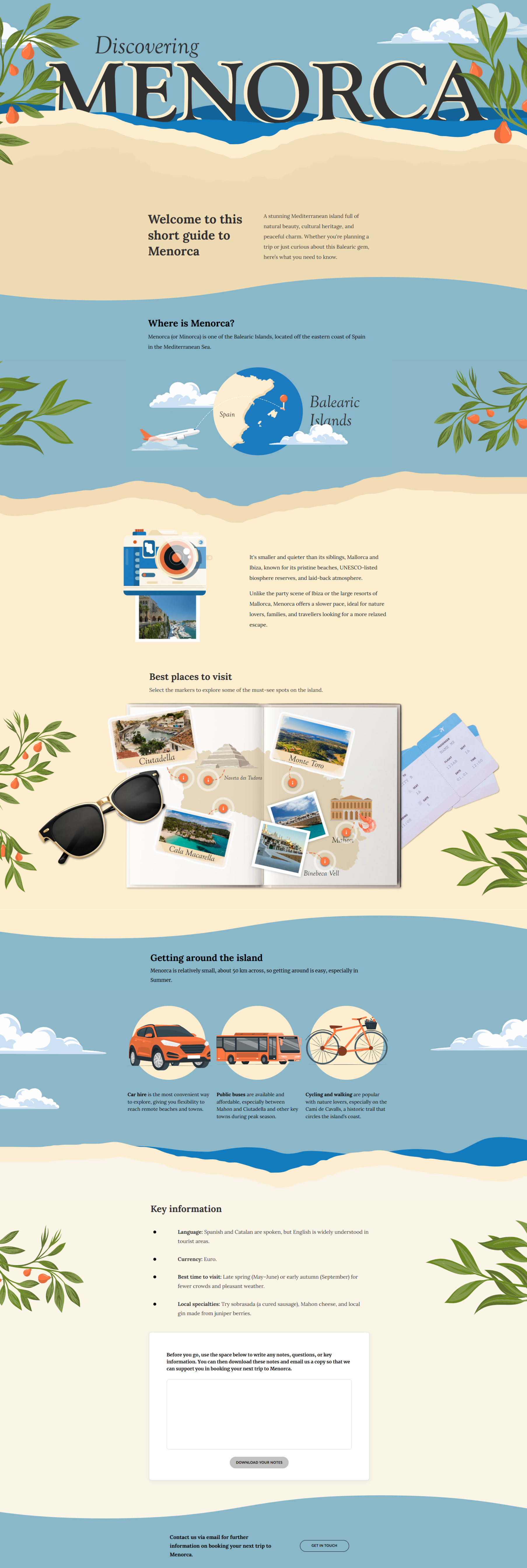
I did use two interactive blocks, the first being a labelled graphic. Within the module there is a section around the best places to visit on the island. Instead of just having this as flashcards or bullet points, I wanted to make it more visual and engaging. Therefore, I created a graphic representing a map of Menorca and used polaroid photo ‘pop outs’ with markers, which the learner can select. This then displays information about a specific town or place on the island.
The only downside to this approach was that the labelled graphic function doesn’t perform amazingly on mobile devices. The user can still access the markers and select them, but the image does not resize to be more viewable.
If this were to be rolled out for a client, I would probably have to change this activity, potentially now using custom HTML code, as we have this new code block feature within Rise.
The next interaction I used was a reflective block. We don’t currently have this in Rise, so I used the Mighty plugin. This ‘eLearning’ doesn’t require any assessment or quiz, it’s purely for knowledge transfer. Therefore, I felt it would be good for the user to write down any thoughts, questions or ideas they have and be able to download this and take it, or email it, to their travel agent.
The Mighty reflective block works perfectly for this, allowing the user to do as described above.
-
I wanted the design of this course to really represent Menorca as a place.
When drafting up a mood board, I researched different areas of Menorca, what plants grow there, what the climate is like etc.
I gathered image inspiration and begin to pull together a colour palette too.
As Menorca has lots of coves, clear blue Mediterranean seas and fresh fruit, I wanted to pull this influence into my colour palette.
I opted for a soft beige representing sand, accompanied by a darker and lighter shade of blue and then a bright orange accent colour.
To ensure the colour palette was accessible I added a dark grey to be the main body text and I checked the colour contrast of this against the blue and beige.
As this eLearning is mostly text, the visual design had to have the ‘wow’ factor. I also wanted to add in a little bit of movement too, so opted to create a short GIF.
I recoloured an illustration of a polaroid camera, then created polaroid shots with imagery from Menorca. Within PowerPoint I then added animations to make it appear as if the camera flashes and then the polaroid picture appears.
It is a very simple animation, but is eye-catching and effective against static text.