


Healthy Habits Microlearning
As continued development of my skills, I set myself the task of creating a 10-15 minute microlearning on the topic of building healthy habits.
I wanted the microlearning to be split into bitesize chunks, to be completed in 5-minute intervals and have a Duolingo, app feel to it. It was therefore key the microlearning be mobile friendly and responsive.
PROJECT DETAILS
Role: ELearning Developer and Instructional Designer.
Brief: creation of a mobile friendly microlearning centred around habit building.
TOOLS
Genially.
Affinity Designer.
SKILLS
ELearning development.
Graphic design.
Instructional design.
I decided to try out Genially for this build, as I liked the fluidity you get when designing screens. Being able to freely place interactive objects, buttons etc, meant I could be more creative with the look and feel of the design, this is important as Genially has limited functionality, therefore you often have to think outside the box when ensuring your courses do not become repetitive or boring.
I felt Genially’s gamification functionality suited this project well, within the tool you have access to dice, counters, randomisers etc. I wanted the eLearning to feel playful and light-hearted, it is supposed to be enjoyable and digestible. Something the individual can easily do on their morning commute, which doesn’t require a lot of mental strain. The main theme is around positively creating new habits and not shaming the person for their current, less productive ones, therefore the structure and content of the eLearning needed to mimic and reflect this.

My response to the brief
-
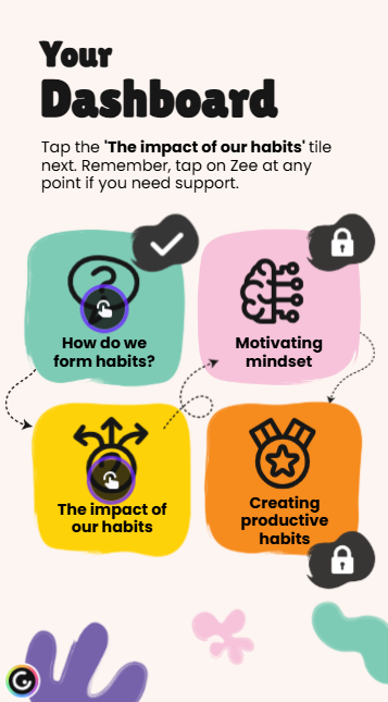
This is a very short gamified microlearning, therefore content had to be kept ‘punchy’ and direct. When scoping out the topics for the course I stuck to four key areas, split into what, why and how.
Topic one - What is a habit and how are they formed? (What) This provides the context and necessary knowledge for the learner to understand what will be covered in the learning.
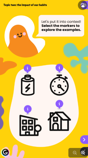
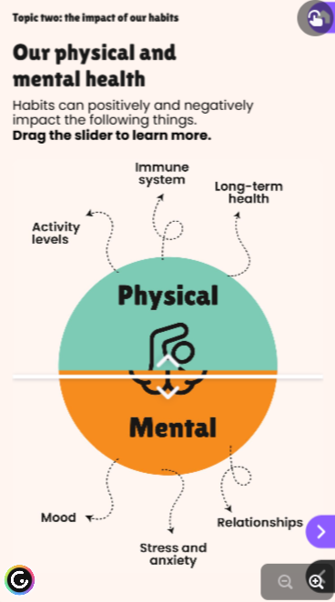
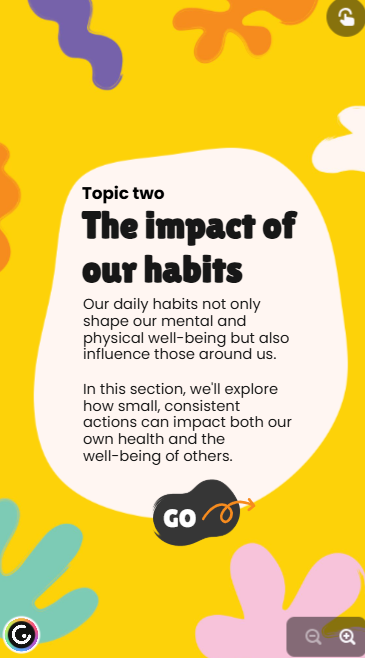
Topic two - The impact of our habits (Why) This section builds the ‘what’s in it for me?’ the ‘what’s the point,’ the learner needs to understand this in order to feel invested and engaged in the learning. Chances are they already want to make positive changes, but this adds the foundations as to why it is beneficial to do so.
Topic three - Mindset in habit formation (What)
Topic four - Creating productive habits (What)
The main bulk of the microlearning comes from the ‘what’, this is where the individual will learn key skills in order to make the positive changes suggested in the previous topics. This section is where they can practice things, reflect and apply knowledge to their individual circumstances.
As with all my eLearnings, I create a macro and micro structure. Once I have the topic headings in place, I break this down further to begin fleshing out what I envision sitting under each topic. This makes sure I only include information that is truly relevant and it helps me to begin identifying any interactivity or opportunities for reflection. I also use my C.A.R (Context, Activity, Reflection) structure to help with this too.
With such a short eLearning, it was key I cut out the ‘fluff’ keeping my writing concise, direct, but with a friendly, informal tone. I didn’t want the learner to feel that they were being assessed or judged, more so that the eLearning is there to support them. As a result there’s no end quiz or assessment for this eLearning, instead plenty of opportunities for reflection to cement their understanding and identify how it relates to them.
-
Genially has limited functionality compared to other authoring tools, therefore I had to be creative in how I used it. As I was working with such a small slide space, I opted to stick to one or two interactions per screen, to avoid cluttering the area. I leaned heavily on markers, flipcards, multiple choice questions, video and audio. I added a gamified element through a scenario activity, which allowed the learned to use a randomiser to select a scenario for them to try.
Visual design played a huge part in being able to vary the layouts of my slides. So even though I may have used markers twice in one section, I was able to present them differently so they didn’t feel repetitive. I also used the functionality for things that it wasn’t necessarily intended for, for example a flashcard which reveals the answer to a reflective question.
I saw this as a welcomed challenge, to not rely on interactivity to carry the eLearning, instead being very deliberate and purposeful with what I was choosing to ensure it was supporting the content and not just hiding things behind click to reveal for the sake of it.
What made this such an enjoyable authoring tool to work with was that much of the pre-programming of the interactions is already done. For example, animations, colour etc. Therefore it made the build quick and easy. This freed me up more time to focus on the visual design of the course. I also liked that I could easily send myself over a shareable link to the course and then open it on my mobile device. This allowed me to constantly test my work, to make sure it was performing well on mobile.
-
Continuing down the theme of Duolingo, I knew I wanted this eLearning to have a guiding character. This character would then pop-up throughout the eLearning, providing tips, support and general encouragement, similar to Duo, the green owl for Duolingo.
I created this abstract character ‘Zee’ to do this. I wanted this character to be genderless and non-human as I felt it would be easier for people to build a connection to and relate to it. This also helped in terms of being able to have a bright and colourful theme. ‘Habit’ building is quite an abstract concept too, therefore I knew sourcing imagery could be difficult, therefore instead I decided to stick with illustration. Using Zee to guide the learner and opting for a playful background of different coloured shapes. I wanted to create a vibe of playful but not childish, therefore I turned to Pinterest for inspiration, sourcing pictures of character based apps and simple packaging design.
From this I created a simple colour scheme and chose a curved font for any headings, but a readable, generic font for the body text. Accessibility was incredibly important too, therefore I kept the background a soft cream, using the brighter colours as accents only and a ‘off’ black as the main text colour. Being on a mobile device, accessibility can be even more tricky, so I ensured text was well sized and avoided putting too much on a screen.

As this was only a personal project, I didn’t build the eLearning in its entirety. But if you would like to have a go, please select the button below. Please keep in mind some functionality hasn’t been programmed in.