


Sprout
Microlearning
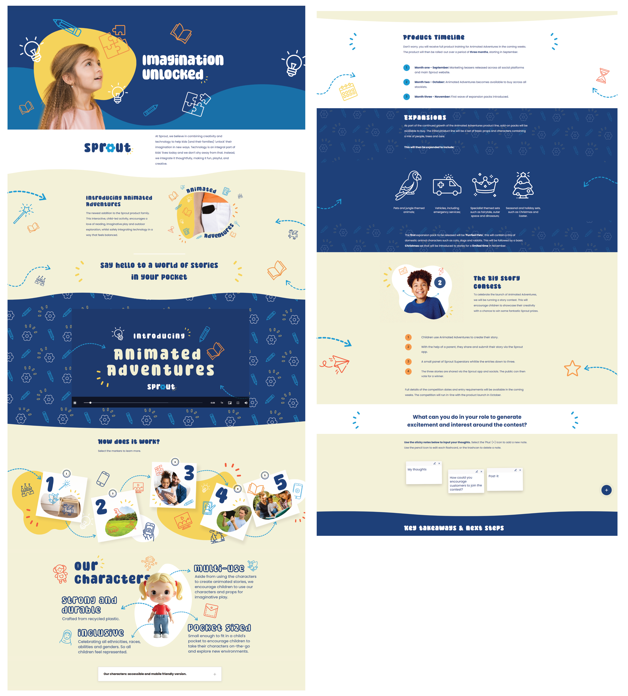
As continued development of my skills, I set myself the brief of creating a 10-minute microlearning for a fictional children’s toy brand ‘Sprout’. The microlearning was for all colleagues to complete and announces the release and development of Sprout’s new product, ‘Animated Adventures’.
The microlearning was to provide information on what the new product is, when it is going to be released and how it fits in with Sprout’s current product range. This would then be followed up with more technical product training.
Have a go at the eLearning by selecting the following button:
PROJECT DETAILS
Role: ELearning Developer and Instructional Designer.
Brief: creation of a product launch microlearning
TOOLS
Articulate Rise.
Affinity Designer.
Canva.
SKILLS
ELearning development.
Graphic design.
Instructional design.
As a company, Sprout is keen on combining traditional methods of play with technology. The brand is fun, playful and childish and I wanted this to be reflected in the tone of voice and visuals of the eLearning. I took inspiration from brands such as Innocent and Lego and used their social media accounts to provide me with suggestions as to how they communicate with their customers.
This eLearning is also meant as a marketing piece, it is not only providing information to colleagues, but promoting the new product. Therefore it was important to me that the content itself felt ‘punchy’, concise and also generated excitement around this new product.

My response to the brief
-
It was important to not go into too much depth with this eLearning as the learner will be provided with detailed, hands-on product training after completing this course. Therefore I knew from the outset that I didn’t need to go into too much detail in terms of how this product will function. Instead, it was more about providing basic information, key dates and generating excitement.
I began by outlining the key topics that I wanted to cover over the ten minutes and this helped inform my learning outcomes too. I kept this simple, sticking to:
What ‘Animated Adventures’ is.
How it works.
Who it is for.
When it is going to be released.
Your responsibility.
With only ten minutes to work with, it was important to keep each section concise and to the point. Instead of creating a storyboard I decided to flesh out my ideas straight into Rise. This allowed me to have good visibility over the length of the content I was producing, but also begin to think about which blocks I wanted to use as well.
-
Although the microlearning is only 10-minutes, I wanted it to feel as engaging, fun and interesting as possible. Rise as a platform can become quite repetitive due to the lack of functionality, therefore I had to be creative in my choice of blocks. Aside from basic text blocks, I set myself the challenge of not using each interactive / multimedia block more than once.
I also opted for blocks that allowed me to be more creative in their design, such as labelled graphics, full bleed images and text and image. For the ‘what’ section I really wanted to use a short explainer video as I felt this was more engaging than simply reading text on a screen. To keep this realistic with the intended development time of the module, I used Canva to create the video. I gathered existing images and illustration I had already used throughout the build, along with Stock video footage and some AI imagery, to create a very simple animated video to introduce Animated Adventures. Using Canva’s in-built animation and transition tool meant I was able to create a really effective video, with low development time.
Whilst deciding on interactivity it was important to maintain a balance of encouraging the learner to do something, versus them just reading information. I didn’t want to gatekeep content behind clicks, if it didn’t really need it. Therefore, for every one or two ‘click-based’ blocks I tried to include a more static interaction, such as a list or plain text block.
One block that I was really excited to play around with was custom code. I’m not a coder, but made use of ChatGPT to help me bring to life a sticky note, brainstorming activity.
Rise is very lacking in any kind of reflective block that allows the learner to input their thoughts and ideas. Therefore, I wanted to bridge this gap in a way that still felt fitting with the content itself.
I decided on an activity where the learner has to brainstorm ideas around how they can generate excitement regarding an upcoming competition. They can add their ideas to sticky notes and use the ‘plus’ button to add more notes to their mindmap. I had to do a couple of revisions with this activity to iron out any problems with responsiveness and general UI, but I’m pleased with the extra interactivity it brings.
-
I wanted the childish, fun tone of Sprout to be present in the visual design of this course. As the company is fictional, I wasn’t working with any brand guidelines, so decided to pull together some ideas based on my own perception of childhood and creativity.
I loved the idea of using mixed media, taking imagery and overlaying illustrations to look like doodles. As a child I often doodled on my work and to me it feels like a very ‘daydreamy’, childish thing to do.
I pulled together a very simple colour palette for Sprout, using soft blues against bright pops of colour. The blue and cream combination acted as my accessible colour pairing, allowing me to integrate orange and yellow as icons and other accents.
It was important to include photography that represented children and adults of a range of races and ethnicities, so I took advantage of filtering options on Stock sites to ensure I was accessing a diverse range of images. I did have to lean on AI image generators to create the images of the product itself, but I tried to keep the use of AI minimal where possible.
I wanted this eLearning to be very maximalist, busy and in your face, but in a way that is well-thought out and intentional. To do this I incorporated repeat patterns, high quality imagery and icons, throughout the entire build. I wanted the eLearning to feel a little bit like an ideas whiteboard, where the product team may have jotted down their thoughts and ideas about this new product. Therefore within the blocks I’ve used icons to look like doodles, arrows to point towards specific content and a labelled graphic set up to look like post-it notes on a pinboard.
Whilst designing the course I made sure to screenshot and flatlay it every so often. This helped me to see where there was any repetition and perhaps where I may have been unintentionally ‘over-designing’ the blocks. For example, towards the end of the course there’s a product timeline list block, this was originally in the dark blue. However, when I flatlayed this section I realised it felt a bit too much, after the learner had just had a section that was very visually striking. I therefore decided to strip this right back, choosing a white background and minimal decorative icons. This allowed some ‘breather’ space, before moving on to the next section.
Overall I’m really happy with the design of the course and feel it incorporates Sprout’s fun and creative brand ethos, whilst remaining accessible.