


Let’s Talk Limited Companies
ELearning
When I first switched over from a sole trader to a limited company, I found the change daunting and overwhelming. Whilst there is a lot of information out there to guide freelancers, much of this is jargon heavy and can be difficult to understand and apply to your specific circumstances.
Now running an established limited company, I found myself reflecting on how I wished there had been a straightforward, jargon-free guide for me to reference and turn to, to support in making the process of becoming a limited company feel a little less scary.
From this I decided to use my knowledge of both running and setting up a limited company to create this short 15-minute guide myself.
Have a go at the eLearning by selecting the following button:
PROJECT DETAILS
Role: ELearning Developer and Instructional Designer.
Brief: creation of a comprehensive, jargon-free guide regarding running a limited company.
TOOLS
Chameleon Creator.
Affinity Designer.
Canva.
SKILLS
ELearning development.
Graphic design.
Instructional design.
I wanted to also use this project as a chance to try out the authoring tool Chameleon Creator again. I had previously used this tool for my ‘Goal Getters’ eLearning and loved the simplicity of customisation options of the tool. Therefore I wanted to see if when dealing with slightly more ‘conventional’ or ‘grown-up’ subject matter, there would be enough, or the correct functionality to bring my course to life.
I actually found Chameleon Creator to be a great tool for this subject matter as it allowed me to chunk out and break down topics into manageable sections. It also allowed for enough freedom and flexibility in the customisation, which enabled me to create a really fun and playful visual identity for the course.
It was key that this course be mobile accessible too, something that is supported by Chameleon’s functionality.


My response to the brief
-
I started the scoping for this course by jotting down the key components that the eLearning needed to have. This included being mobile responsive, around 15-minutes long and using an informal, casual tone of voice.
I also made sure to define the skills gap or ‘why’ of this eLearning and the intended audience. In the case of this project, I noted that the intended audience would be anyone who is currently self-employed as a sole trader, or who may be considering becoming self-employed but isn’t sure which path to take.
These individuals may have an idea of what a limited company is or how it works, but may not know what is suitable for their circumstances or business. They may not know the right questions to ask, or could be finding the information online confusing and overwhelming.
Whilst the intention of the eLearning isn’t to provide circumstance specific information for every profession, it needed to provide relevant and tangible scenarios to support the learner in being able to apply the knowledge to their situation.
As the eLearning is more of a comprehensive guide than a traditional ‘course’, knowledge checks weren’t needed. But I wanted to include ‘understanding points’. These didn’t have to be in the form of multiple choice questions, moreso little check-ins to consolidate learning before moving on to the next section.
Now that I had defined the audience and skills gap, I then began to consider what it is I would have wanted to know when deciding to become a limited company and where I felt information or guidance was missing.
These questions or reflection points helped guide my course structure. As the intended duration of the course is fairly short, it was important to be very intentional with the topics and not include any ‘fluff’ content. It was always my intention that learners would be able to revisit sections and easily access the information they need. Therefore I wanted all content and topics to have a logical flow be written in a question and answer style.
I settled on eight topics in total all titled as a question. (for example topic 3 is, ‘why choose a limited company?’) After writing down all the ideas for my topics, I then worked on creating a logical flow for these.
When writing out the content for each topic the most challenging aspect was ensuring that all information or explanations were written in way that was easy to understand. This meant being creative in the examples I was providing too. If I used a scenario that was too specific, the learner may find it hard to imagine themselves in that situation. Therefore it was challenging to explain quite complex topics such as tax, in a way that was still generic yet tangible.
Alongside this I had the extra layer of difficulty thought keeping the tone of voice light and informal and ensuring the content wasn’t too lengthy. To support with this I used ChatGPT to skim over what I had written and spot ways in which I could condense sentences or remove filler / fluff words. I then was sure to reread the outcome and adjust the tone to suit.
-
Defining the interactivity was the simplest part of this project. My chosen authoring tool, Chameleon Creator has a good range of functionality, but isn’t overly complex meaning I was fairly limited on my choices for interactivity.
In the context of this project this didn’t prove to be an issue. As this course needed to be mobile friendly and wasn’t structured like a ‘traditional’ eLearning, I knew I wanted to keep clicking to a minimum. With the content being short and concise, I relied more heavily on having text displayed on screen with striking visual design.
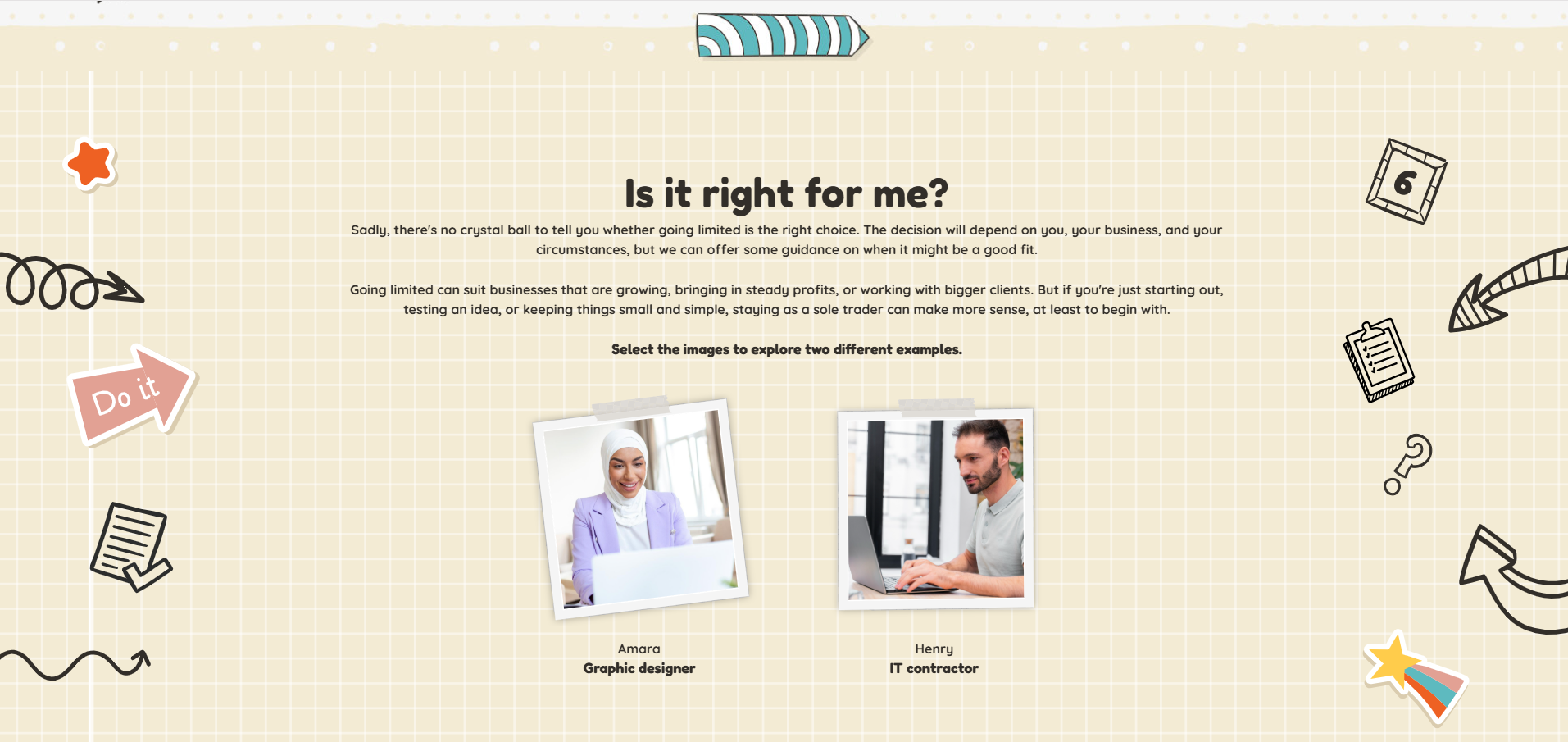
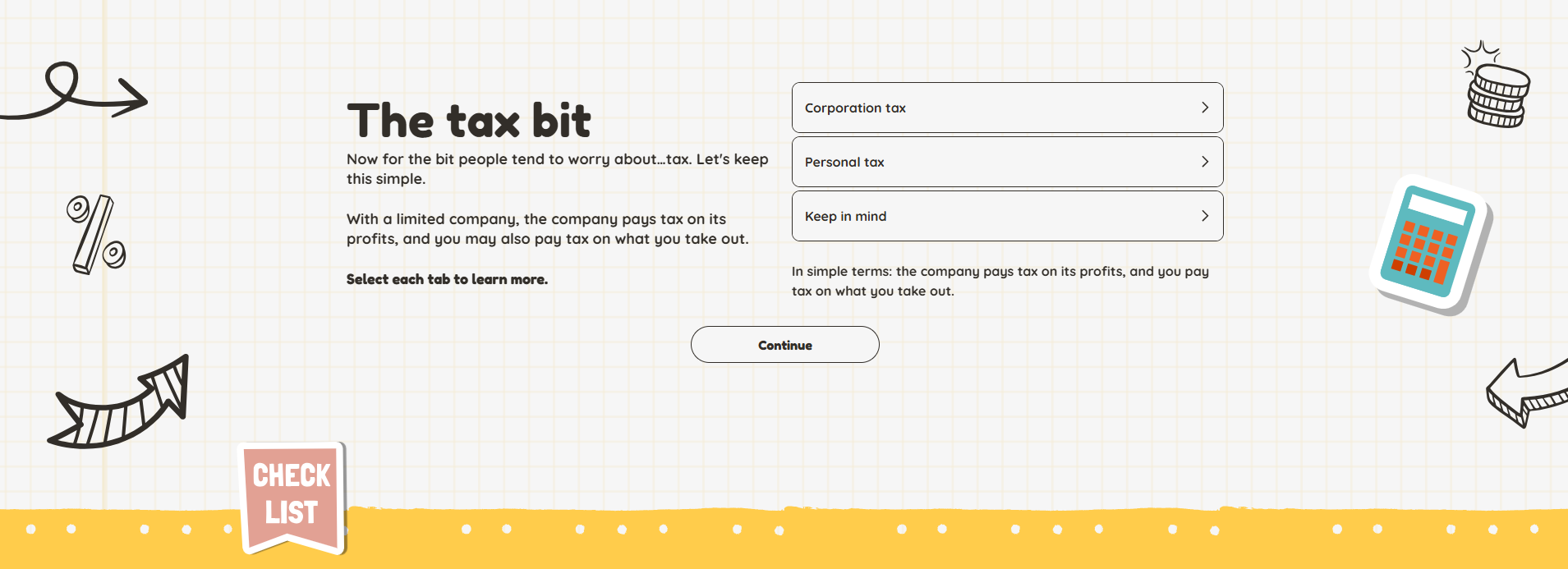
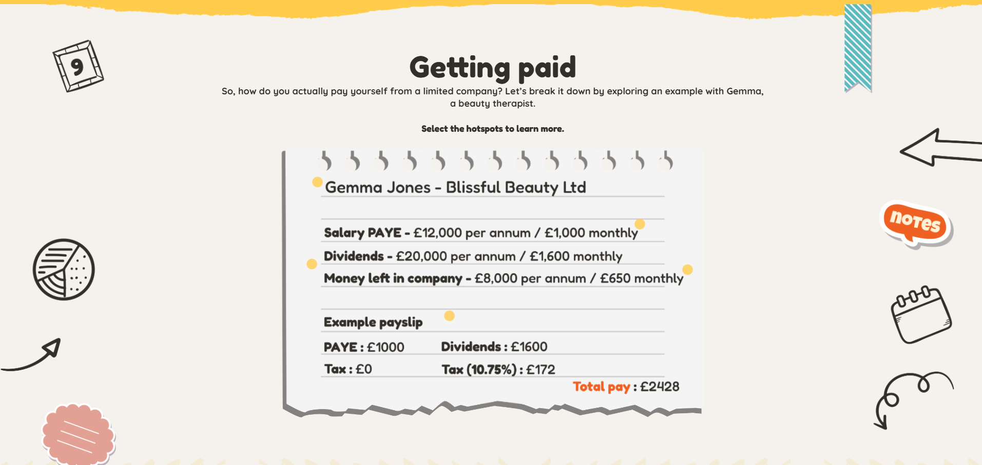
Where there was slightly more content to present, I leaned on interactions such as labelled graphics and accordions. This was mainly to avoid the user having to do too much scrolling if on a mobile device.
As this is intended as a guide rather than a course, it was important that the learner be able to jump back to a section if needed. To achieve this I turned on Chameleon’s menu function, but also added a refresher section at the end of the eLearning. This presented the key topics of the guide and allows the learner to jump back to a section as needed.
-
When working with complex or ‘dry’ subject matter such as tax, quite often the visual design will be very corporate and plain. I knew from the outset that with this course I wanted to go the opposite way and have the visual design match the light and informal tone.
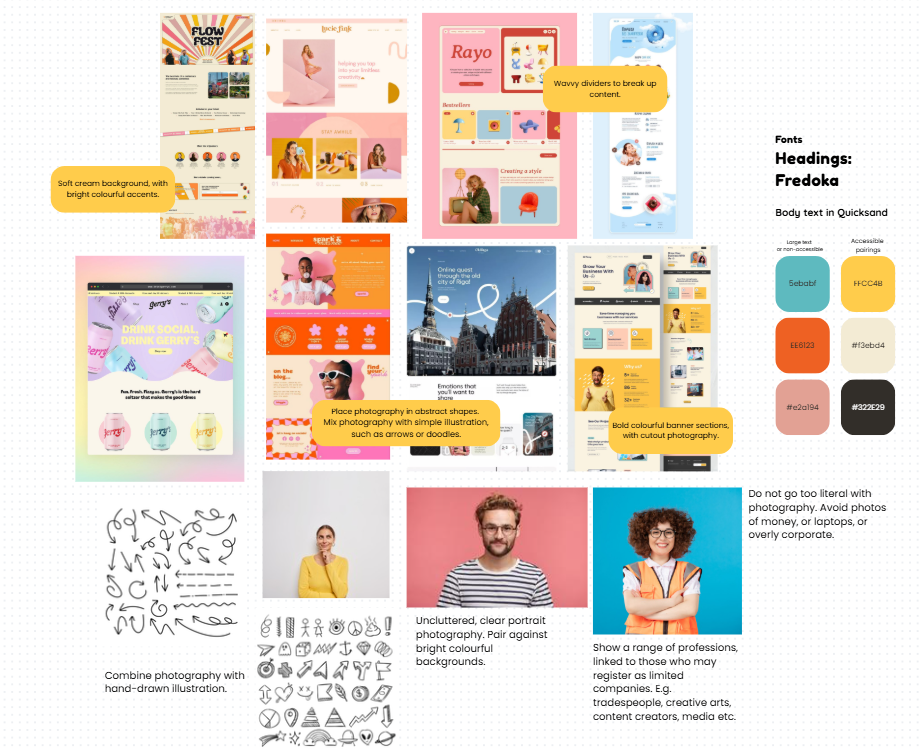
I created a moodboard on Canva to begin pulling some ideas together and found myself being drawn to bright, summery colour schemes and websites that used a mix of photography and illustration.
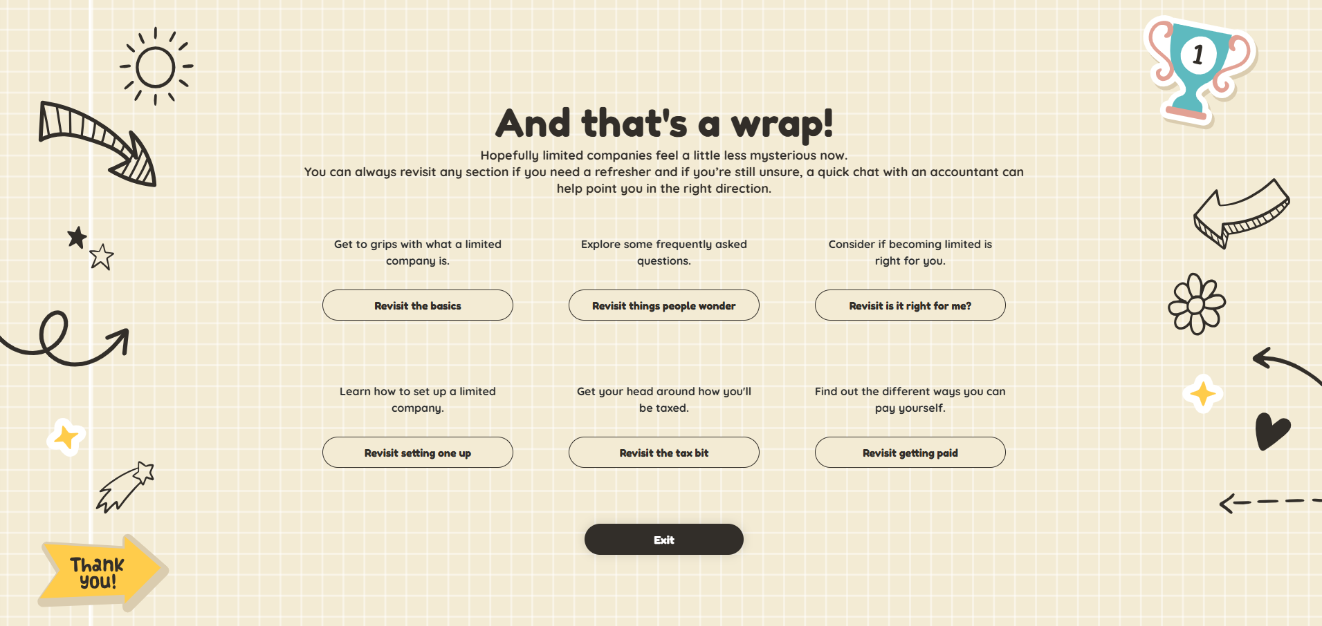
I really wanted this to feel positive and inviting instead of dull and corporate, therefore I pulled together a colour scheme of bright pinks, oranges and yellows. To ensure accessibility I defined a dark grey shade for my text and a light cream background.
As I began building out the course and playing around with illustrations and icons, I started to lean towards using a doodle style. I layered different doodled illustrations on top of a paper texture background and felt this made the course resemble a journal or notebook. I felt this really fitted with the purpose and tone of voice of the course, as it made it appear like someone was taking notes and writing their ideas down on a page.
It was however important to not overdo the background visuals and make it too distracting or busy. Therefore I mostly placed doodles to the sides of the page and used ripped paper style dividers to transition between sections.
Sadly on mobile, a lot of the doodle design gets cut off, but the dividers and textures backgrounds are still visible. I also tried to incorporate visual design on some of the interactivity to help provide a similar user experience for those on a mobile device. For example, I designed flashcards to look like sticky notes. These translate really nicely across to mobile and help to maintain the doodle aesthetic even when the background design isn’t visible.