


goal getters
elearning
As part of my professional development I am always keen to try new software and tools. I had previously used Chameleon Creator as part of my ‘Emma…Tries’ Youtube series and felt that it would be a perfect fit for a new personal project.
I have a neurodivergent son in school year 3, who is mad about football. I wanted to create an eLearning for him that supports his learning at school and his neurodivergence also.
Have a go at the eLearning by selecting the following button:
PROJECT DETAILS
Role: ELearning Developer and Instructional Designer.
Brief: creation of a football themed eLearning course to support my son’s learning at school.
TOOLS
Chameleon Creator.
Affinity Designer.
Canva.
SKILLS
ELearning development.
Graphic design.
Instructional design.
My son having ADHD can struggle with focus, this played a huge factor in defining the length of the content and how it is presented. I decided on a 30-minute eLearning split into three key sections, English, maths and science. I wanted to give my son freedom in how he navigated through the course and how much time he spent on each section, allowing him the option to go back and revisit anything.
Initially I defaulted to Articulate Rise for this course, but I found that in order to create a custom navigation / landing page it would require complex coding and this would impact the overall user experience. Whilst I was initially a bit sceptical about Chameleon’s slide and column based structure, I actually found for this particular content it worked perfectly. It separated the content and activities out into manageable chunks and made it suitable for a child to consume. Chameleon also has a ‘topic portal’ function that acts like a custom navigation page. It tracks progress through each topic and acts as a ‘hub’ allowing the child to see how they’re getting on. This was exactly the functionality I was looking for and it doesn’t require any complex coding or interrupt the UX.

My response to the brief
-
The trickiest part about writing the content for this eLearning was integrating the football theme.
I wanted this eLearning to have a storytelling aspect to it, as this can appeal to children, therefore I had the idea of a football coach Leah, guiding the child through the course.
I then had to incorporate football in a way that felt relevant to math, science and English. I didn’t want it to be that the questions are just football themed, instead that the whole eLearning is centred around one goal or problem.
Therefore, I came up with the idea of three characters, Mia, Leo and Sam, who each have individual problems that they need the learner to help them with.
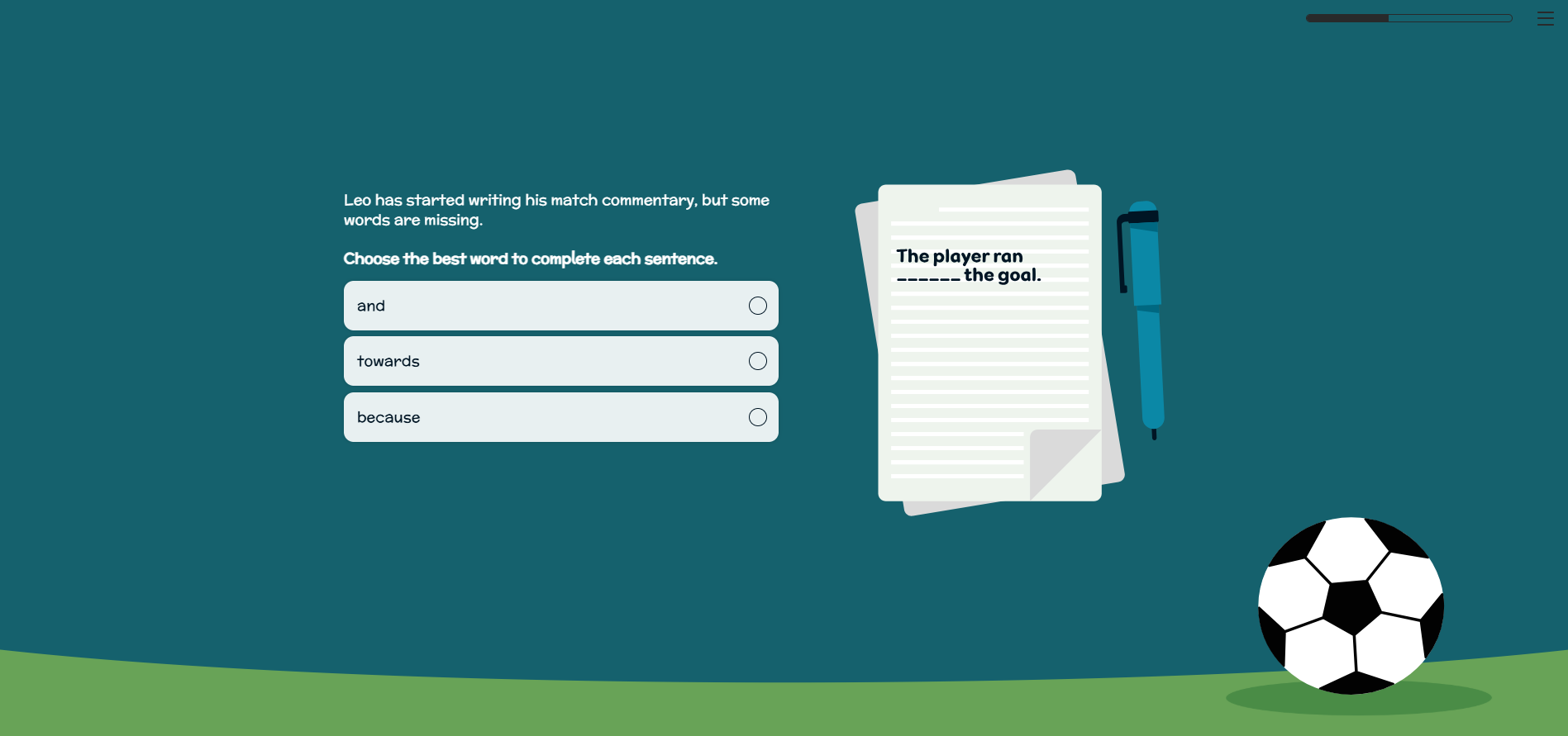
For example, Leo is a football commentator. The learner is then tasked with helping Leo refine his notes ready to commentate on the big match that is coming up.
By answering questions around grammar, spotting mistakes and then writing their own sentences, the learner is then able to ‘help’ Leo pull together well structured notes.
In order to create consistency, each section followed this similar approach. The character is introduced and explains their problem or goal. Then context is given, for example showing a method of calculation, before the learner is challenged with a short activity.
I found the sweet spot for activities was to task the learner with trying it three times. Any more and the activity felt repetitive, but the three times allows for each question to become increasingly more difficult also. This also supports focus and retention of learning.
At the end of each section, Leah thanks the learner for their contribution and then they are guided back to the navigation screen.
Due to the reading age (7-8 years old), I had to ensure all instructions were clear, plain English was used and sentences were not too long or complex. When writing any character speech I aimed to not use more than two or three short sentences, and I checked any words used were appropriate for my son’s age group.
I leant not only on experience of the type of work my son is currently doing at school, but also BBC Bitesize’s website to inform my content. As this eLearning is only intended to be 30-minutes, with just 10-minutes per section, I knew I couldn’t go in to too much depth.
I decided instead that this would be best placed as a ‘refresher’ style course, to challenge what the child should have already been taught in school. This meant I could incorporate a variety of different tasks and challenges, without overwhelming the learner.
-
When designing and developing for children, interactivity can be tricky. My son can struggle to use a computer mouse or trackpad, therefore I knew that the interactions should be clicking or type based.
I did incorporate a drag and drop exercise, which he did struggle with when using the laptop trackpad. This could have been potentially swapped out for a type based interaction instead.
One of the biggest challenges when choosing interactivity was to not make it feel repetitive. Whilst Chameleon does offer a range of different quiz types and clickable interactions, I didn’t want the course to just use multiple choice questions for example.
Therefore I had to be creative in how I used the functionality available to me.
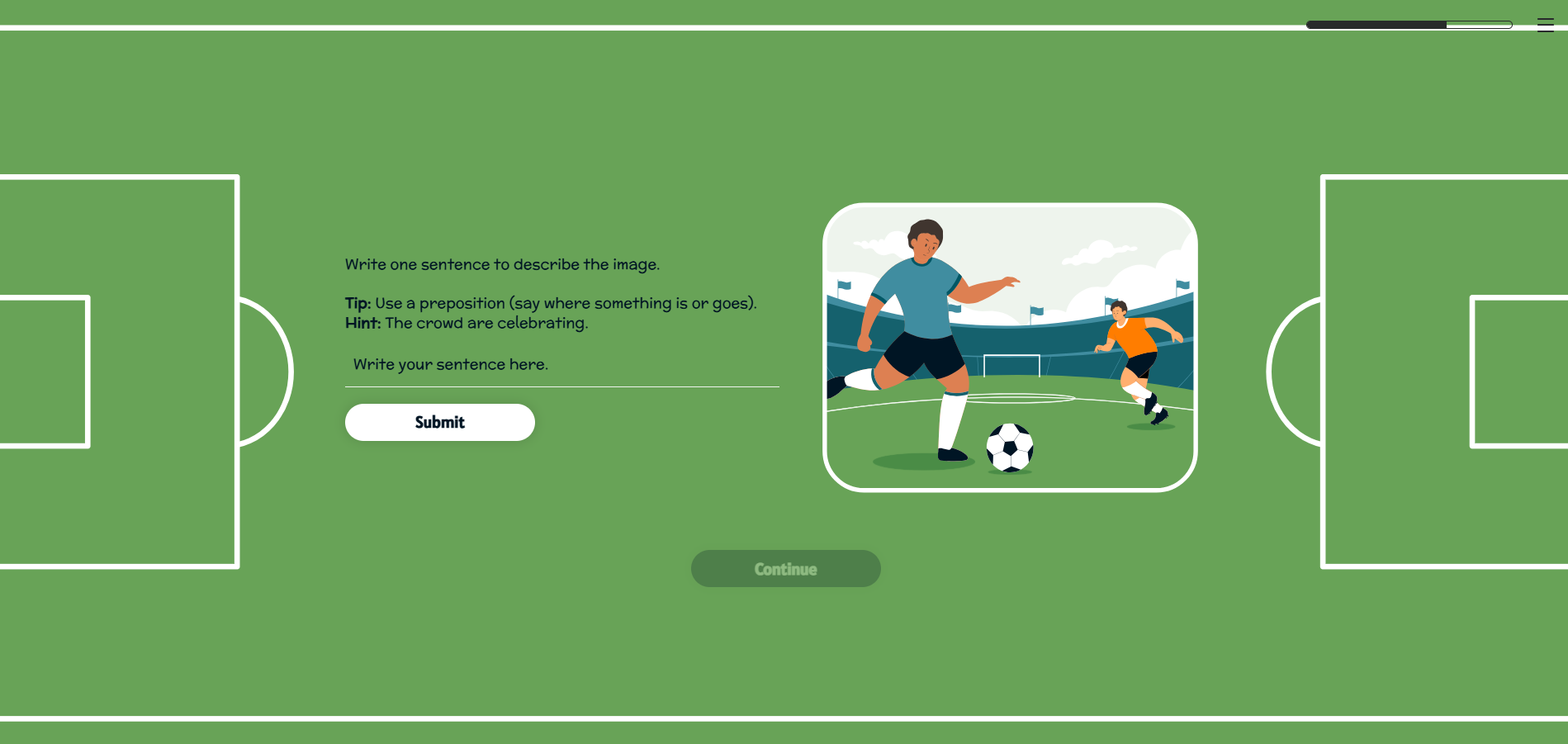
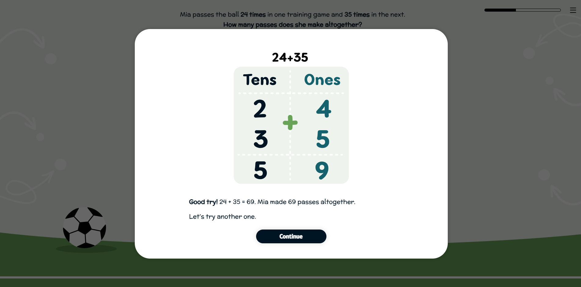
For example, I created an activity where the learner is given an image and they use a text entry interaction to write a sentence describing the image.
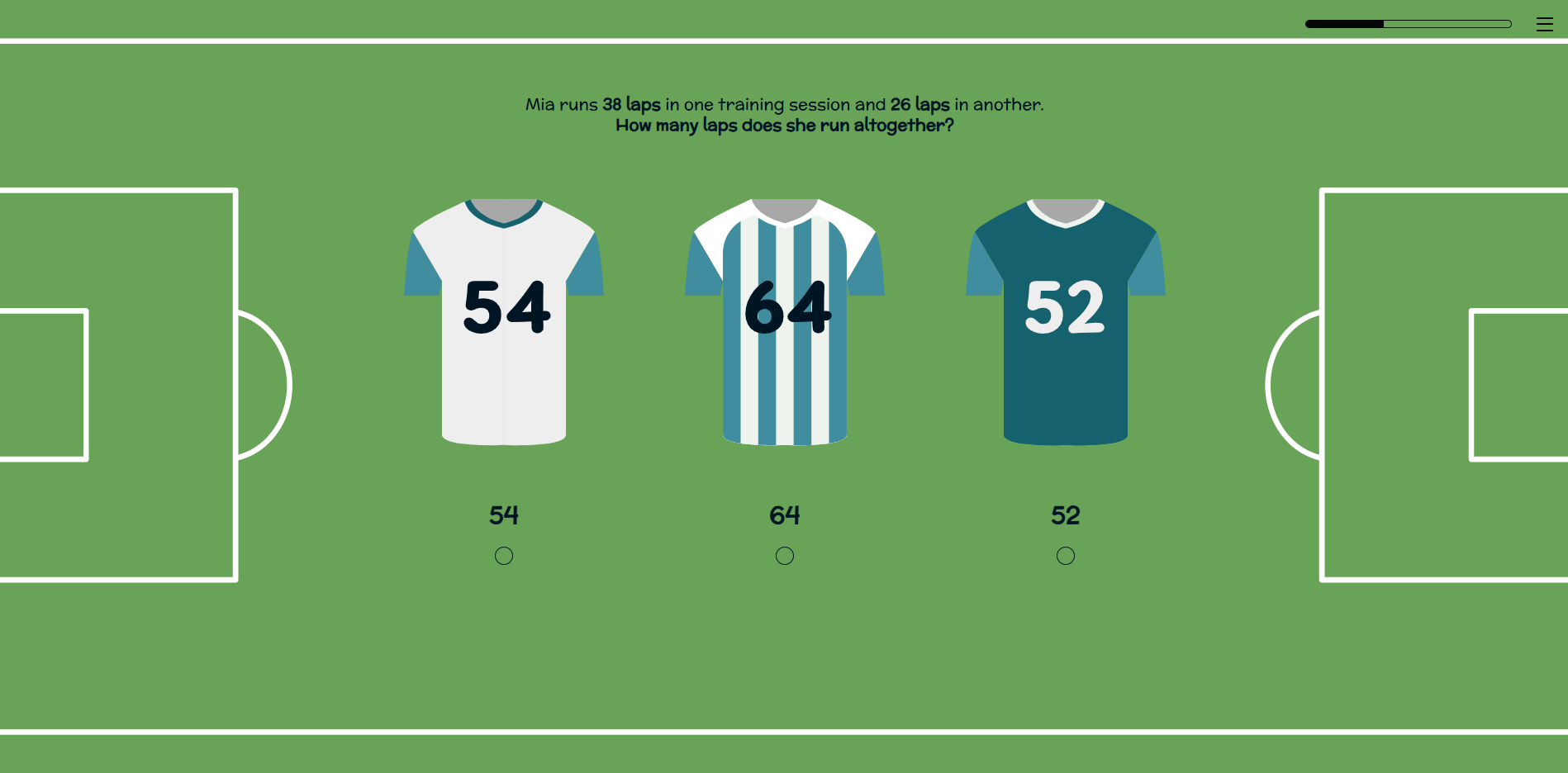
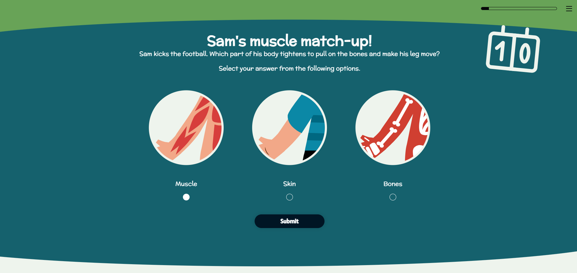
Where I’ve used multiple choice or response questions, I tried to make these as visual as possible. For example I used football shirts with numbers for a math based question.
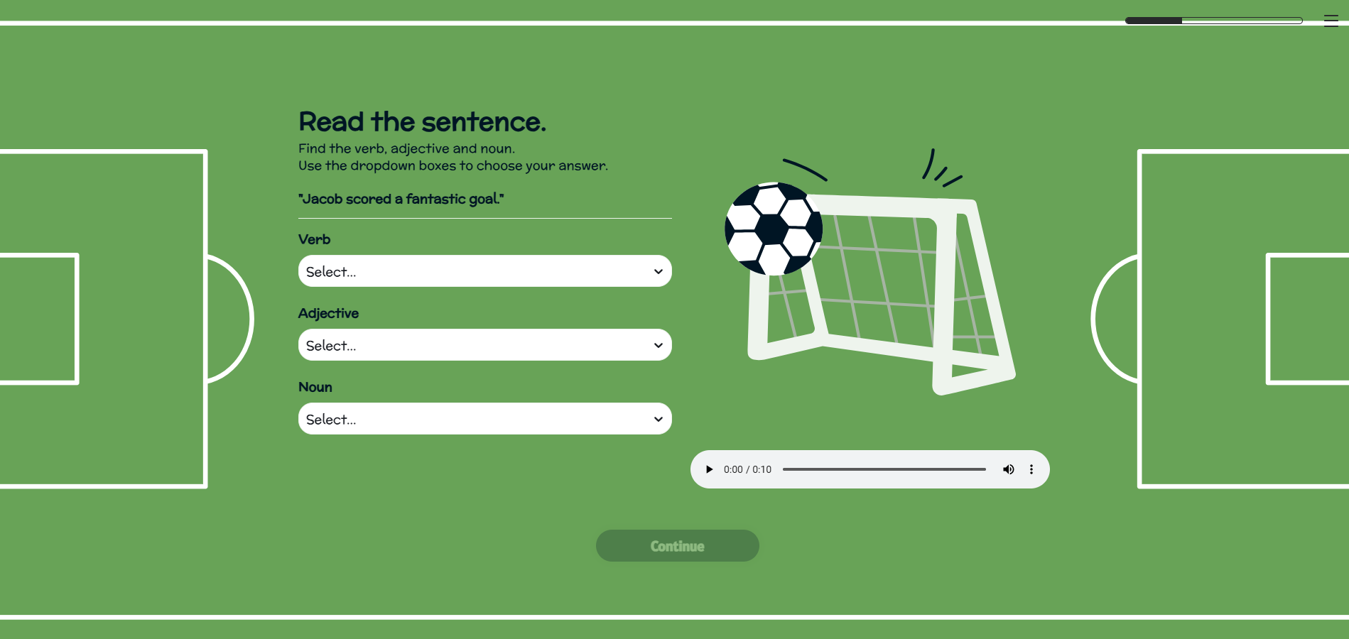
I leaned on the accordion block and flashcards to break up and segment information to make it easier to digest. However, I wanted to keep clicking to a minimal so where possible I tried to just have text presented on-screen.
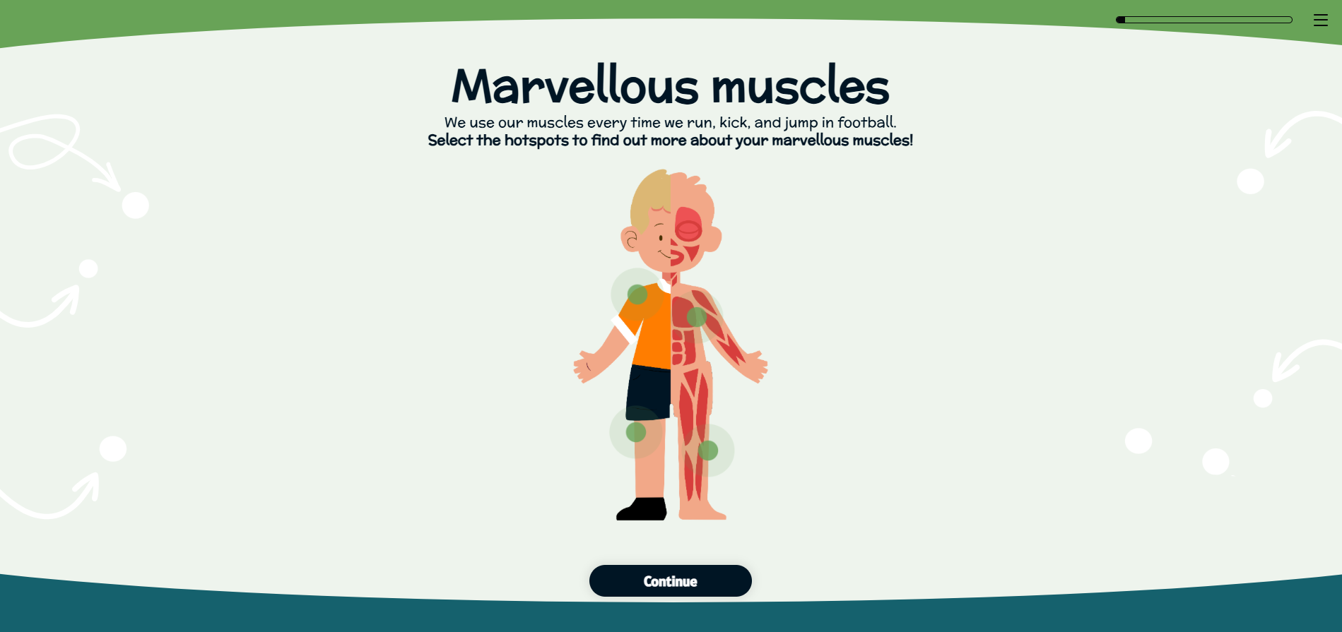
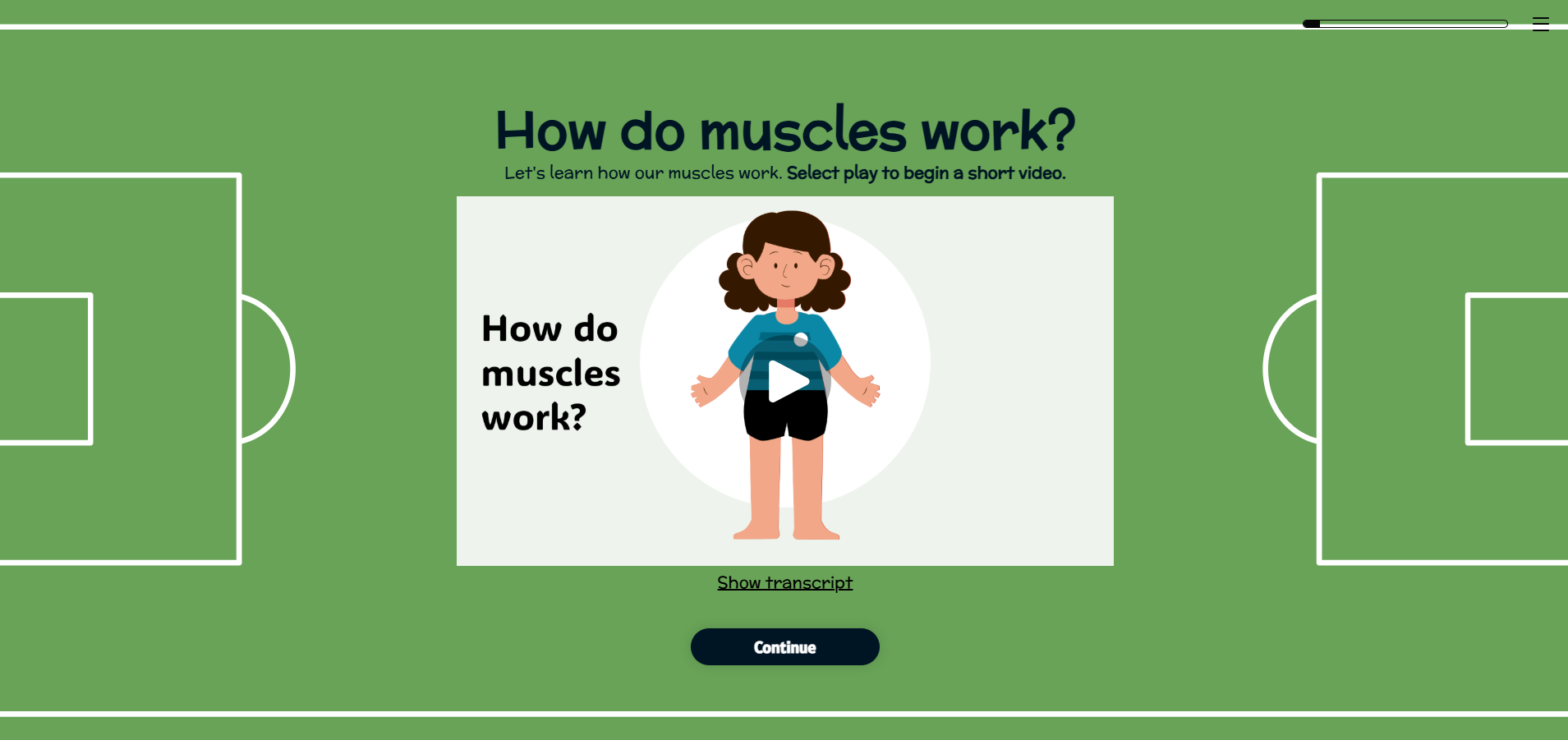
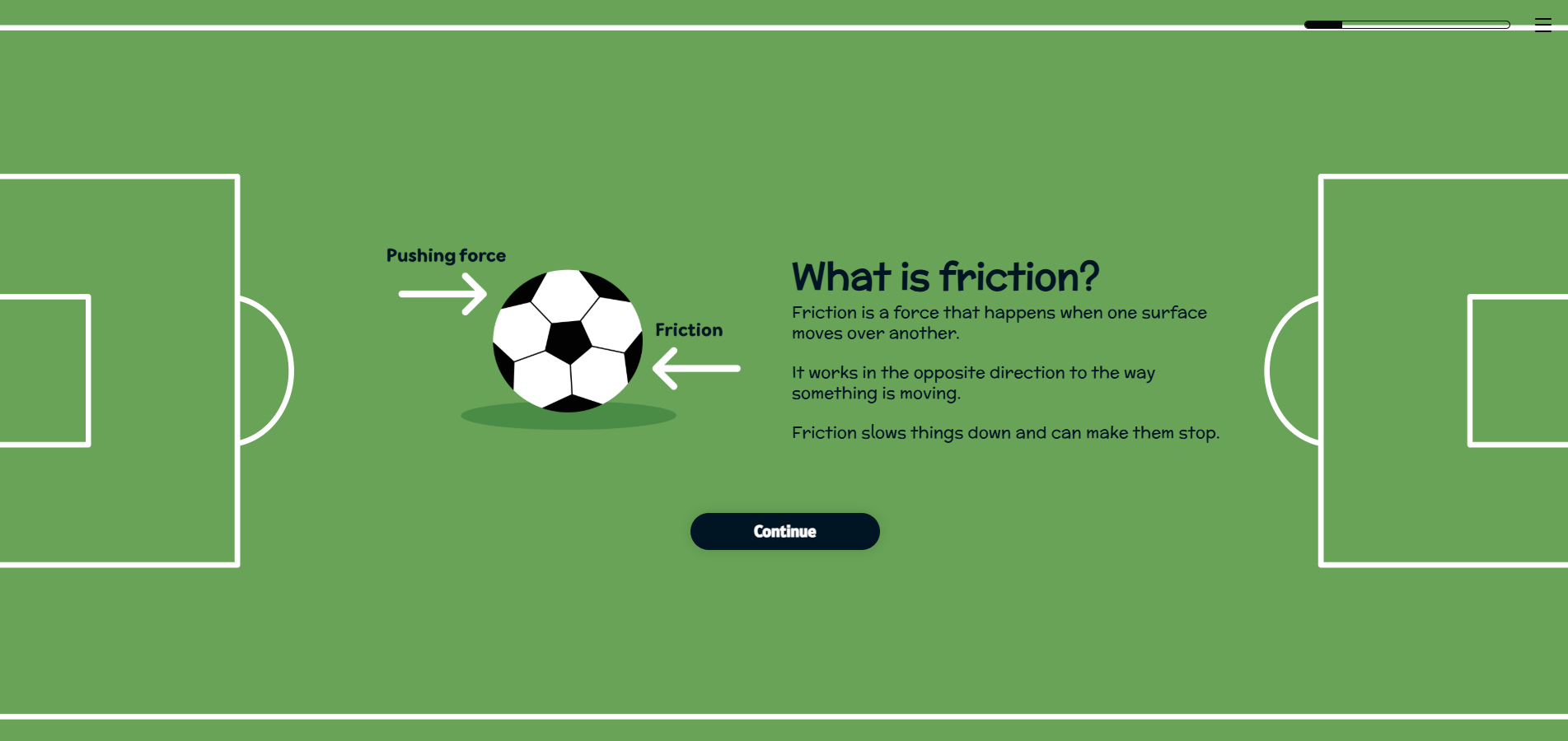
The most difficult section to incorporate interaction was science as this is typically quite a physical subject. I used a hotspot activity and video to help deliver and demonstrate some of the content.
Instead of shoehorning in interaction for the sake of it, I decided to create an activity where the learner is encouraged to move away from the eLearning and go and experiment. They are tasked with choosing an object and seeing how it moves across different surfaces. This I felt was a nice break from completing activities on-screen and supports the way in which my son best learns too.
-
It was key with the design of this course that it reflected the football theme.
I found designing in Chameleon really easy. I was able to set up my theming with font settings, colour choices and button specifications. This made the initial setup of my course quick and simple.
As Chameleon works in a slide by slide way, I didn’t need to go too mad in designing a load of different backgrounds. I created four designs that worked and just repeated these. I brought in the football theme by creating a ‘pitch’ background and a simpler design using arrows and dots to mimic a coach planning his football formation.
Within these backgrounds I incorporated dividers, so that should the learner scroll up after completing a block, there would be a seamless divide between each section.
Accessibility was my biggest hurdle here. As I chose a colour palette that incorporated some bright shades, such as a grassy green and deep blue, I had to be careful in choosing my background colours.
I made sure I had a lighter shade that could be my main background colour and used a WCAG checker to make sure the contrast of the green against the dark grey text met requirements.
I then had to make sure each text box had a corresponding coloured background to ensure that none of the background detailing would interfere with the text and potentially impact accessibility.
The overall look of the course had to feel playful and fun, therefore I chose a rounded more childish font. I opted to use illustrations instead of photography (aside from a small section within the science topic) and wanted characters that looked friendly and inviting.
It was tricky trying to gather illustrations in a consistent style, but I used sites such as Freepik to input reference images to help me.
Most importantly, it was key that the design not detract from the content. With my son having issues with focus, too much variation in design or backgrounds that were too cluttered or busy, would just steer his attention away. As with the content I felt less is more was the best approach, opting for consistency or quantity.
I added some fun little touches to the feedback slides, making use of GIFs showing a ‘goal’ sign if the learner gets the answer correct, or a football flying through the air if they get it wrong. I wanted to move away from a check and cross, as the eLearning is meant to be uplifting, encouraging and positive. I felt using a traditional ‘x’ could feel demotivating for a child.